

Geo-Spacial Analysis of Political Digital Media
UX RESEARCH
DATA SCIENCE
ShanghaiTechTwitter
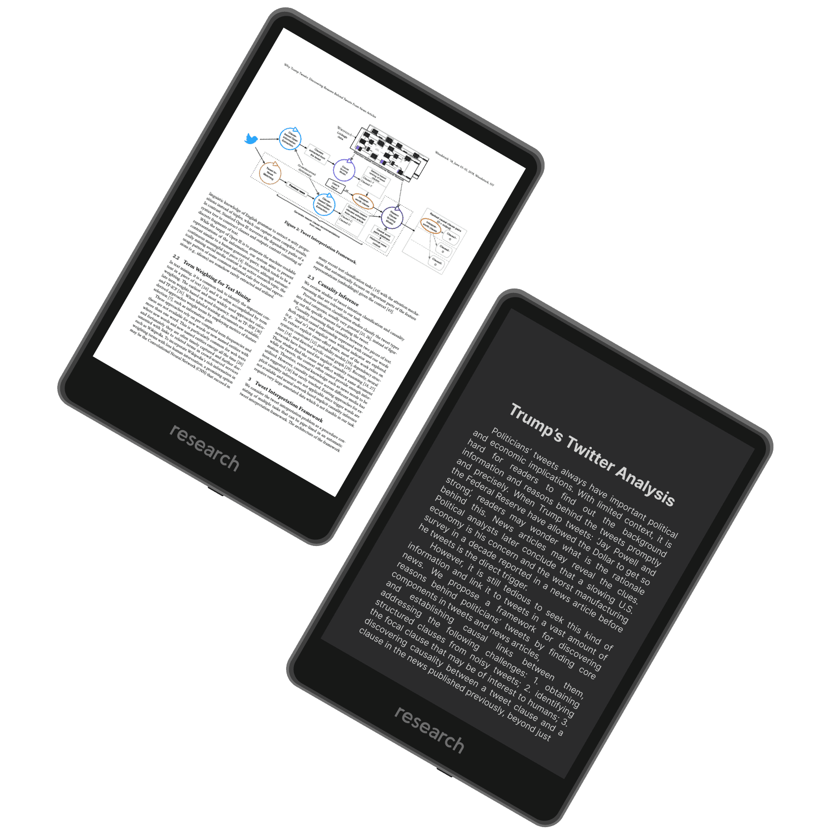
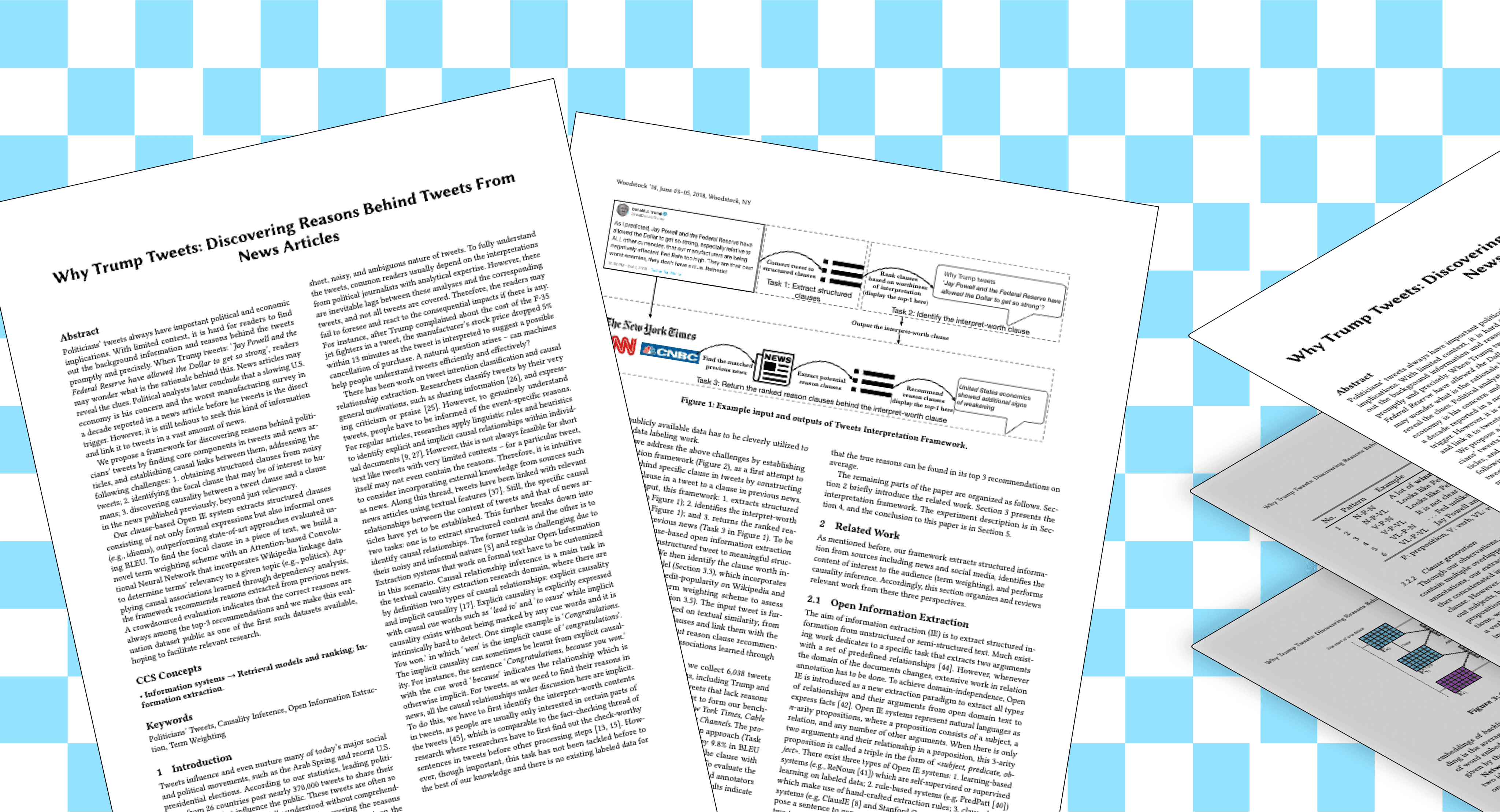
A first end-to-end framework discovering causal backgrounds for politicians’ tweets and news outlets.
In the ShanghaiTech University's research Lab, I immersed myself in a Twitter project aimed at deciphering the complex relationship between politicians' tweets and news narratives. This project blended computational linguistics and political science— which was a profound learning journey, enriching my understanding of digital communication and user-centered design in the realm of political analytics.
My Role
UX Researcher
Data Visualization
Team
ZiYue Li
Hang Hu
He Wang
Disciplines
Collaborative Research
Causal Inference
Information Science
Date
Winter 2021
4 Months
keep scrolling to read the research paper
Introduction
Translating complex, multi-layered political data into user-friendly visual narratives without losing analytical depth.
Industry
Political Media, Data Analysis
Team
ShanghaiTech University
My role ✋
—I was responsible for researching/designing user interfaces and data visualization to seamlessly translate the team's analytics into compelling, user-friendly formats.
My role involved closely collaborating with a multidisciplinary team of computational linguists, data scientists, and political analysts.This required a deep understanding of user interaction patterns, an eye for aesthetic clarity, and a commitment to maintaining the integrity of the complex data being presented.
Challenge⚡️
How can we bridge the gap between complex political data analysis and the everyday user's understanding?
keep scrolling for my reflection
Potential Next Steps ☄️
Digital Media
• Expanding the search and research of other media apps.
• Understanding this phenomonom in other countries/regions
Take the research beyond
Visual Presenting
• The current research paper is only in english and requires high level of ML understanding.
• Exploring how to present the information in visuals.
Build an front-interface
Revisit the Paper
• This paper was published around 3 years ago during Trump in office.
• We can revisit this information and see the development over time.
Compare trends over time
Key Learnings ✨
—Importance of Clear Data Visualization:
As a product designer, this project underscored the significance of translating complex data into intuitive and insightful visual narratives. Effective infographics can bridge the gap between intricate data analytics and user understanding, fostering informed decision-making and deeper engagement with the content.
—User-Centric Design in Analytics:
The project highlighted the pivotal role of user experience in the field of data-driven political analysis. Crafting interfaces and visualizations that cater to the user's needs and cognitive patterns ensures that sophisticated computational findings are not just accessible but also actionable, enhancing the overall impact of the research.
—Interdisciplinary Collaboration:
Engaging in this project demonstrated the power of interdisciplinary collaboration, merging UX design with computational linguistics and political science. This approach not only broadens the scope of design thinking but also enriches the product designer's toolkit, enabling the creation of more holistic and impactful solutions in complex domains like social media analytics and political discourse.


Shipping Systems-First, Responsive Components
visual design
DESIGN SYSTEM
ENGINEERED
Reusable Assets for GitHub Landing Pages.

LET'S

CHAT

Share Stories

Build Together