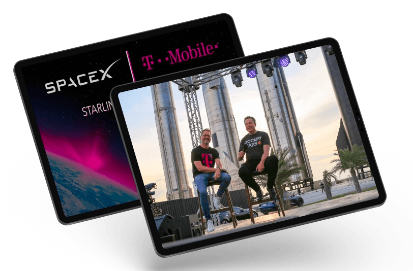

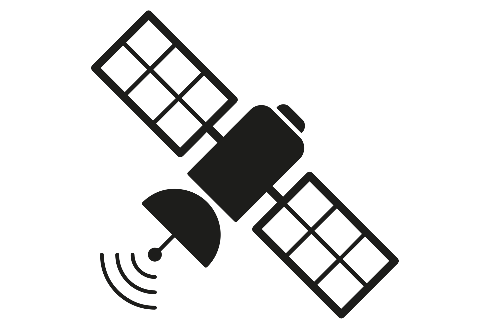
Coverage Above & Beyond with SpaceX
Visual Design
Design System
T-Mobile SpaceX
Designing cutting-edge experiences for SpaceX Starlink's satellite communication systems
T-Mobile's SpaceX Project enhances user experience by providing a reliable satellite solution even in non-terrestrial zones. This project's prototyped experience incorporates geolocation services, emergency communication protocols, and robust data analytics, providing users with essential features like mapping, chatting, and trip planning in the app. The execution involved extensive API development and cross-platform app design.
Stakeholders
SpaceX Leadership
Hardware Engineers
OEMs (Apple/Android)
Design
System Design
User Research
Design Management
Desciplines
Hardware/Software
SDK Implementation
OEM Support
Date
2023
12 Weeks
Organization
Primer
Team
Derrick Ives (Director)
Helen Wang (Sr. Eng Manager)
Tessie Truong (Product Manager)
Michael Turnbull (Sr. Product Design)
Team Introduction ⚡️
Our SpaceX Product team oversee the customer experience of T-Mobile Satellite connection. We maintain a continuous dialogue with T-Mobile's leadership, aligning our app's capabilities and design with the OEM's stringent platform standards.
My Project 🎮
—As a design management intern at T-Mobile, I oversaw the design process of Starlink's app in low connectivity scenarios.
My role involved coordinating cross-functional teams, integrating satellite communication technology, and ensuring the app's design met the rigorous standards required for reliable performance in challenging signal environments.
Stack ⚙️


Internship Overview 💭
—During my internship at GitHub, I immersed myself in the full spectrum of user experience design, understanding limitations and MVPs.

High-Impact Design
I designed and implemented key UI components, focusing on scalability and adaptability.
Leadership/Stakeholder Management
My role involved scaling design systems for efficiency and uniformity. This includes primitives to templates
Accessible Design
Design process and guidelines, ensuring clarity and ease of use for future development
1
2
3
4
5
6
7
8
9
10
11
12
13
14
15
16
17
18
19
20
21
// Installation
"@primer/css": ^21.1.1 from 'propellent'
// Efficiency
"node_modules/@github = 'Develop'|
// Shield
"peer" node = true Schema({
start: {
variant: String,
required: true
},
description: {
type: String
}
}, {timestamps: true})
// Model
export default untitled.model(collection, schema, collection)
Hardware Integration
Identifying and resolving bugs was a critical part of my project. I conducted thorough audits of the new components.
Exploration
Interning allowed me to innovate and explore.
problem space exploration
Context ⏳
Our team conducted multiple forms of research to determine the best Value Proposition, SWOT, TAM, and pain points of our audience.
Challenge ⚡️
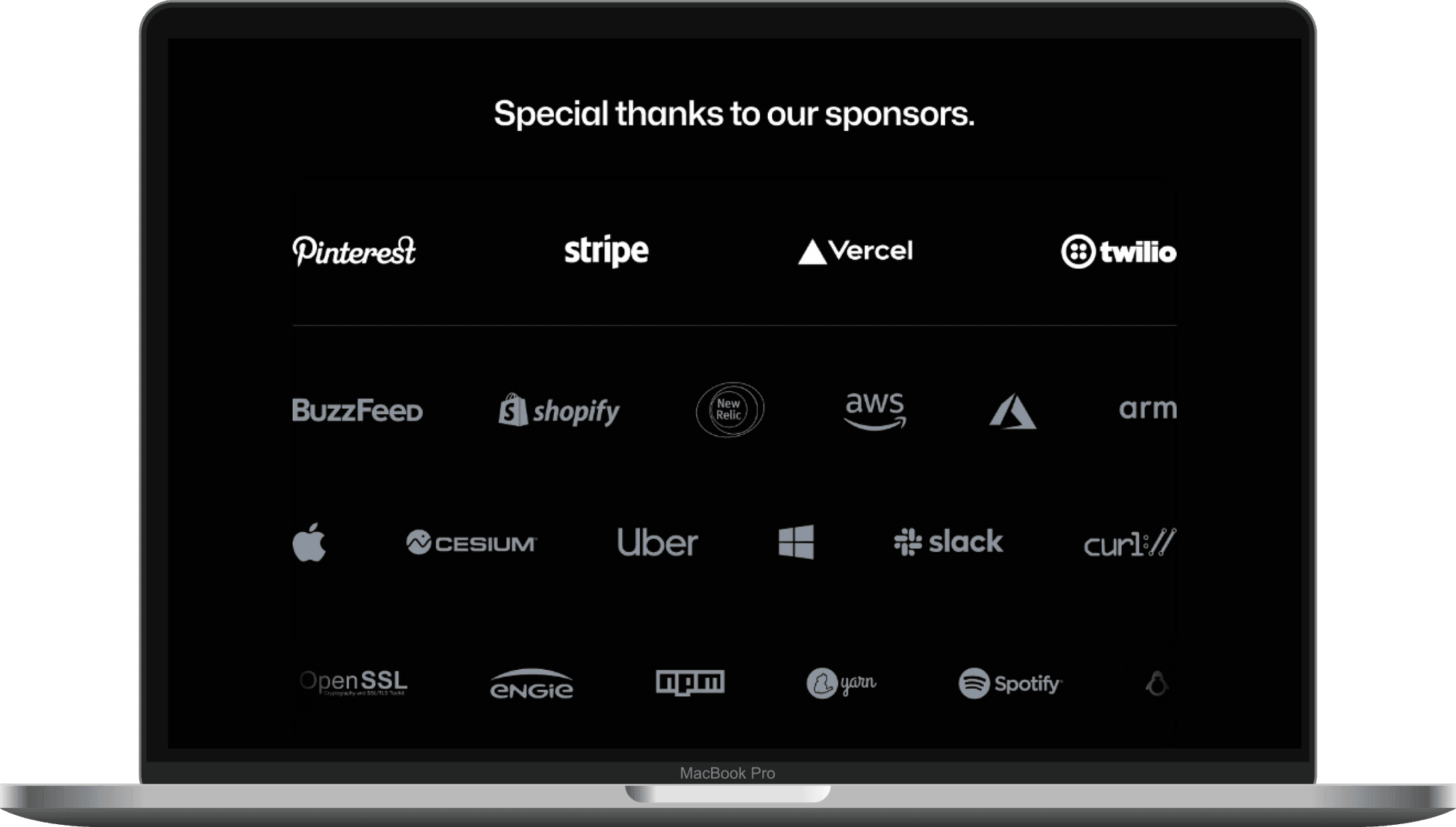
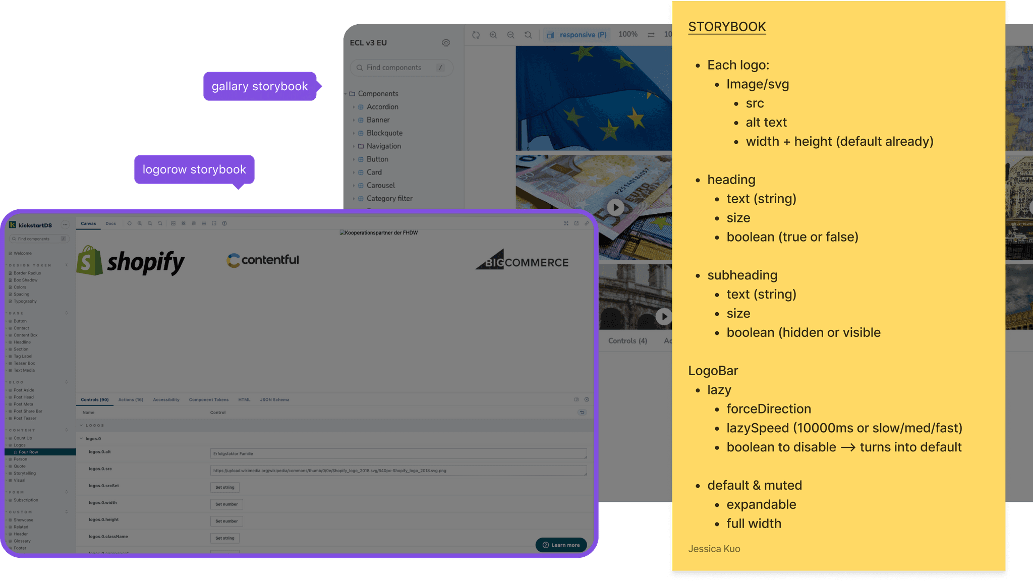
How can we cohesively visualize sponsors/logos while adapting to differing tiers and emphasis? How can we follow GitHub's design language?
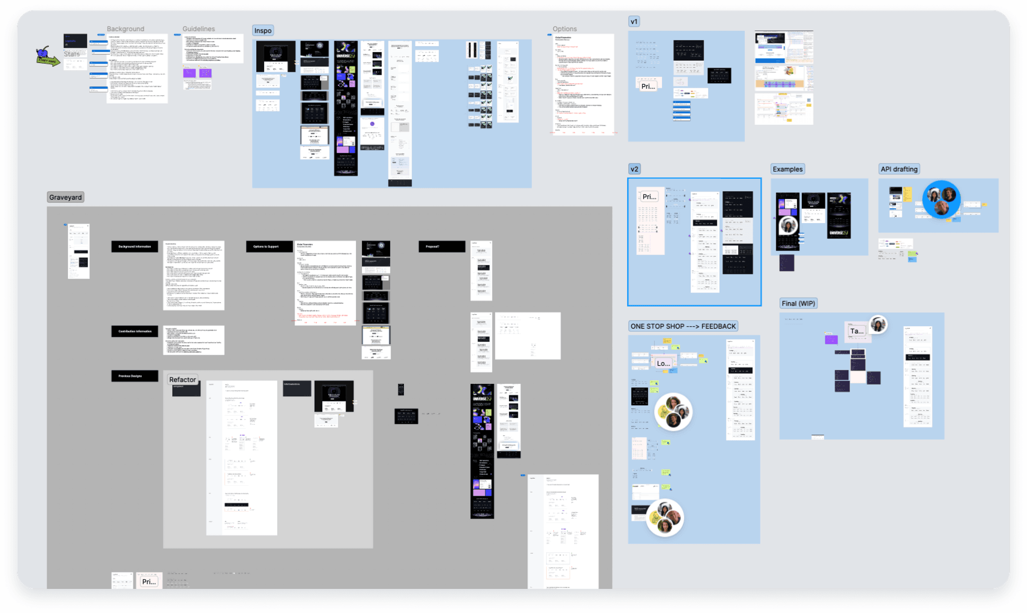
Process 🧩
I began by analyzing GitHub's existing design system to ensure integration. My approach involved iterative design explorations, where I sketched multiple concepts, focusing on spatial balance and aesthetic coherence. I then developed prototypes, testing each for functionality and visual impact.
Regular feedback from the design team and user testing were integral, enabling refinements that aligned with our design objectives and user needs.
Goal 📌
Design, create, ship, and test a component that will:
1
Create a versatile Logosuite component that aligns with GitHub's design language.
2
Ensure the component's adaptability across different use cases and page layouts.
3
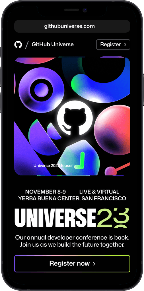
Enhance visual engagement and brand consistency on landing pages, specifically GitHub Universe event.
Research Methods
Competitive Analysis
Storyboarding
User Journey
Customer Interviews
Surveying
Personas
Sample Size
3 Analysis
120 Survey
4 Interviews
10+ communities
2 Personas
User Groups
Students
Companies for B2B
Remote Workers
Foodie/Cafe Hoppers
Platforms Used
Zoom
Google Forms
Facebook/Reddit
Mobbin
Canva
Initial Review 📊
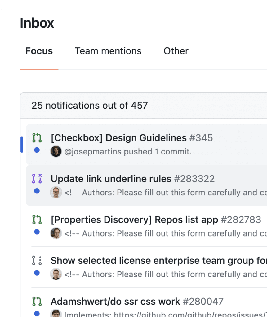
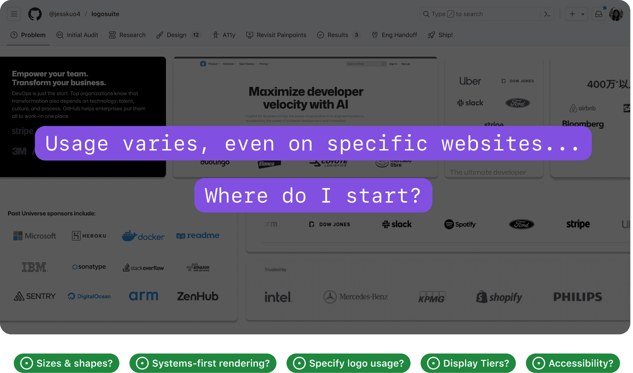
—The current approach to logos on landing pages was disjointed and inconsistent.
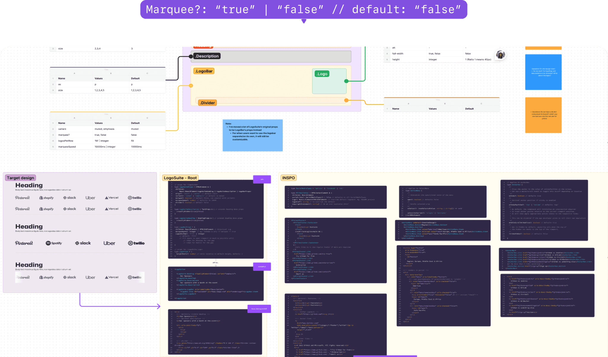
This inconsistency in design failed to leverage the full potential of our space and design elements, leading to a suboptimal user experience. Recognizing this issue was crucial in setting the stage for the development of a more cohesive and effective LogoSuite component.
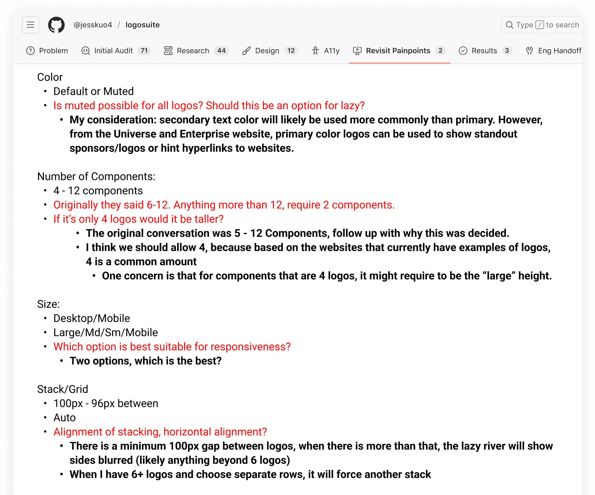
Sizes & Shapes
Achieving a harmonious layout while accommodating this variety was crucial but complex, as it required a design that could adapt to different dimensions without compromising the overall aesthetic.
Researching current usage
Documentation
There was a need for clear, comprehensive guidelines to ensure consistency across different teams and use cases, enhancing the component's usability and scalability.
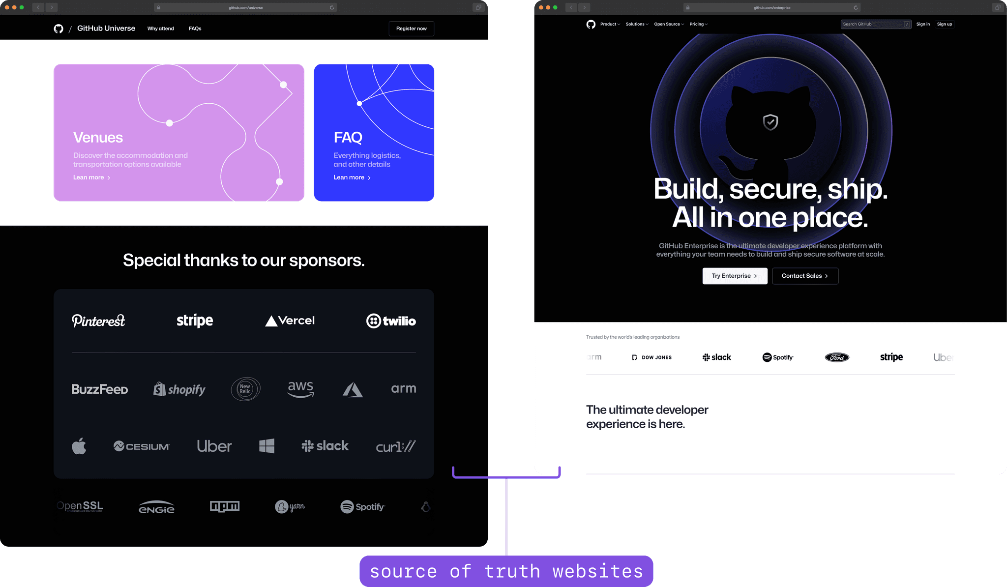
Source of truth and usage
Displaying Emphasis
The design needed to subtly yet clearly differentiate these tiers, ensuring that each logo received appropriate prominence and visibility.
Creating variants
Define 🔭
—This review revealed inconsistencies in size, alignment, and visual hierarchy.
Stress-testing the existing layouts with various logo shapes and sizes highlighted their lack of flexibility and adaptability. I was able to pinpoint the specific issues that needed addressing: the need for a versatile design that could handle diverse logo dimensions, the absence of clear documentation for consistent implementation, and the challenge of appropriately showcasing different tiers of logos.
Source of Truth
Overview ⭐️
Identified the absence of a centralized 'source of truth' for logo display guidelines within GitHub, leading to inconsistent implementations.
Features 📲
Plan to establish a definitive guide or standard within the Logosuite component documentation.
1.
Past Systems
Overview ⭐️
Analyzed previous logo displays on GitHub, noting a mix of styles and layouts that lacked cohesion and adaptability.
Features 📲
Decided to incorporate elements of flexibility and versatility in the new design, allowing for a more uniform yet adaptable approach across various applications.
2.
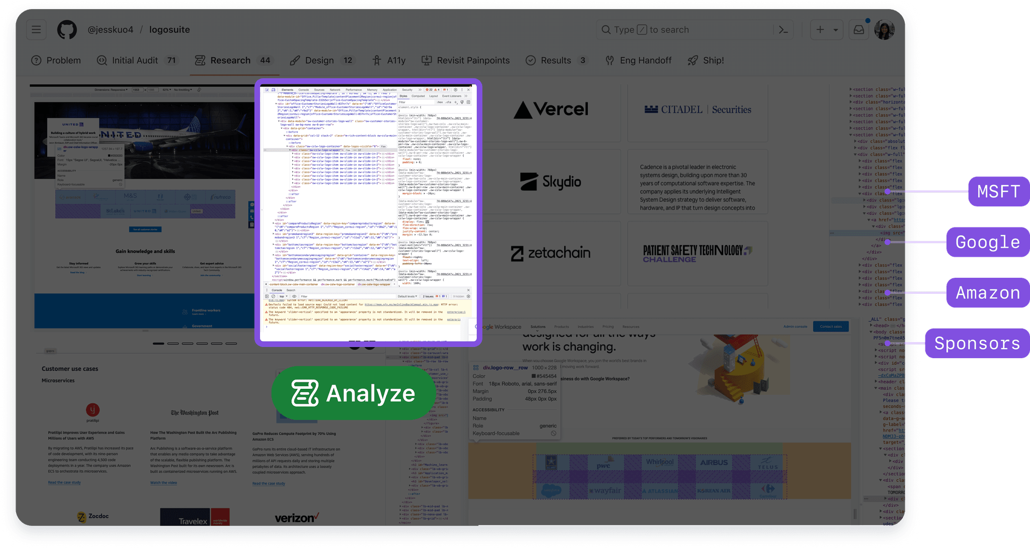
Competitive View
Overview ⭐️
Examined how other companies implemented logo displays.
Features 📲
Aimed to integrate best practices observed from other companies, particularly in terms of responsiveness and visual appeal.
3.
Component API
Overview ⭐️
Explored Storybook and other open-source platforms to understand how similar components were structured and documented.
Features 📲
Proposed to adopt a structured approach to component documentation and storytelling,
4.
Feedback 🤝
—To gain perspective from a system-first view, I conducted/joined numerous feedback sessions.
1
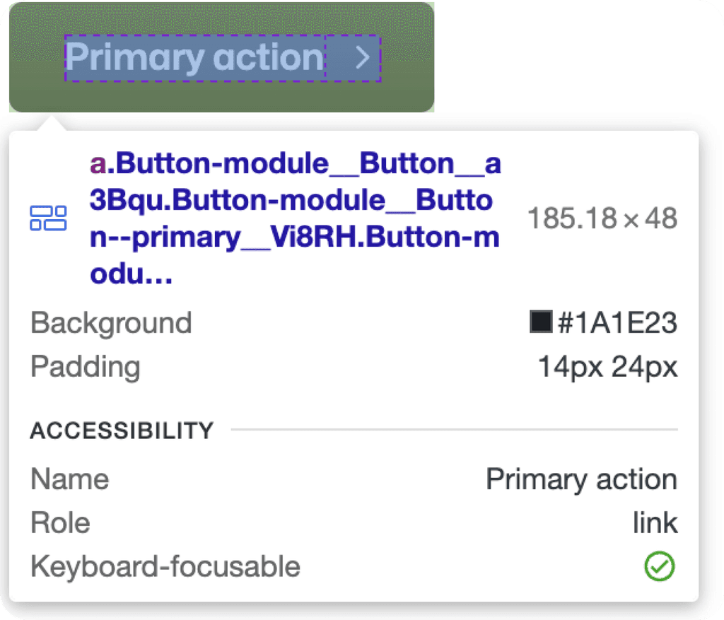
Accessibility Office Hours: Through feedback sessions, I recognized the importance of accessibility in the design, including color contrast, alt text for logos, and screen reader compatibility.
2
Engineering Office Hours: Gained insights on technical constraints and possibilities from the engineering team, such as performance implications and integration challenges.
3
Primer & API: Collaborated with the Primer & API teams to understand how the component could seamlessly fit into GitHub's existing design system and backend infrastructure.
Accessibility ⛔️
Committed to incorporating robust accessibility features in the Logosuite, ensuring it meets WCAG guidelines and provides an inclusive experience for all users.
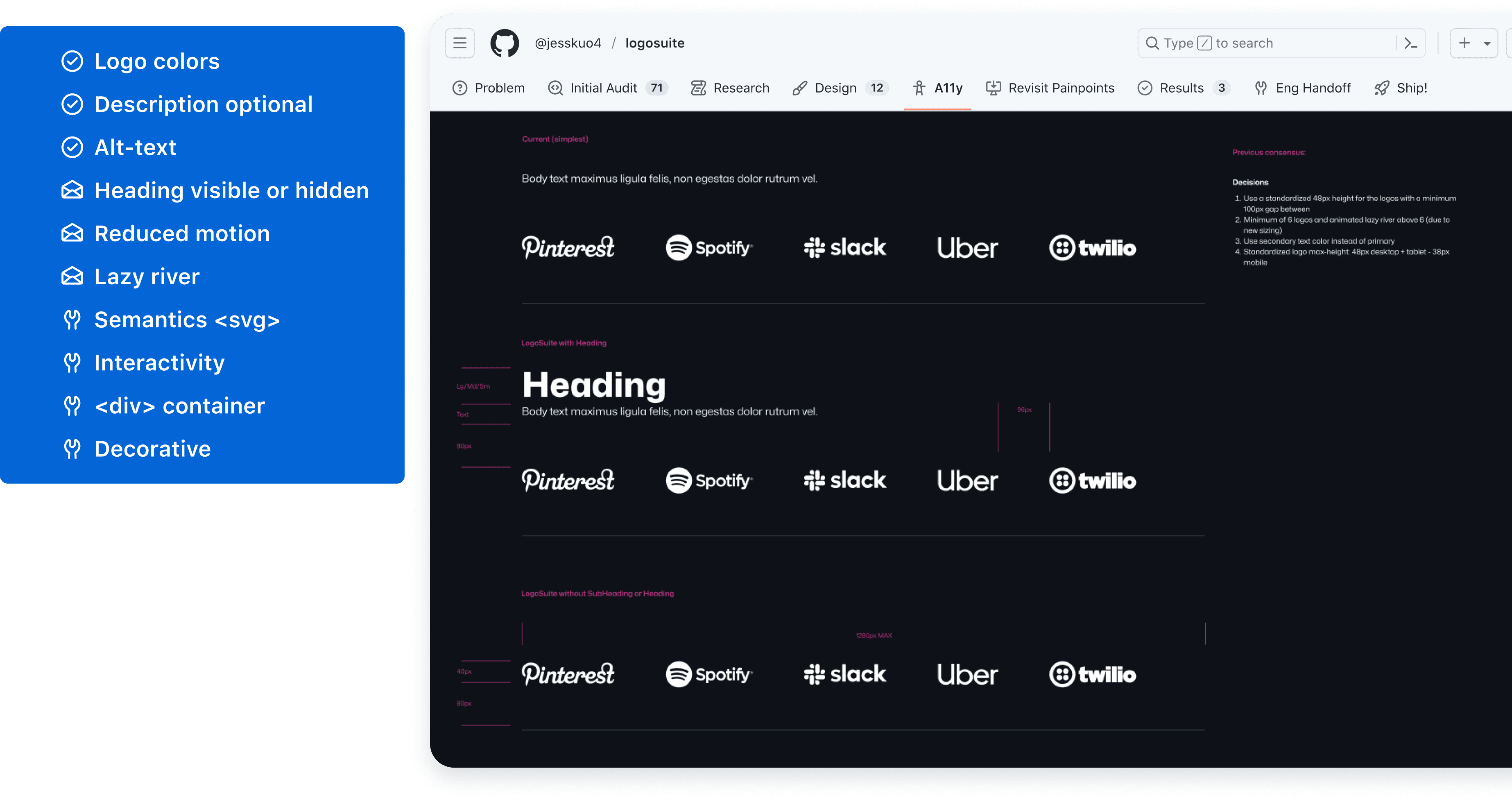
Primer & API ☄️
Decided to closely align the Logosuite’s design with Primer's principles, ensuring consistency with GitHub's UI/UX, and to work closely with the API team.
Suggestions 🗣️
Planned to design the Logosuite with a focus on scalability and ease of integration, using modular coding practices that align with GitHub's engineering standards.
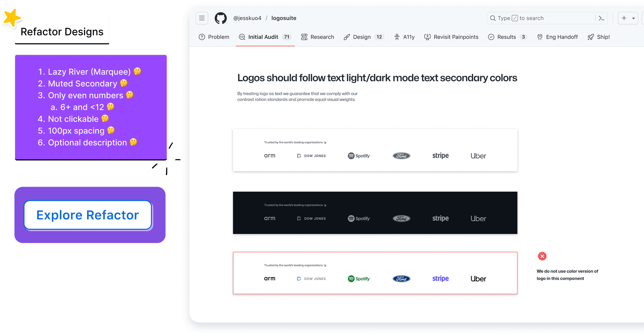
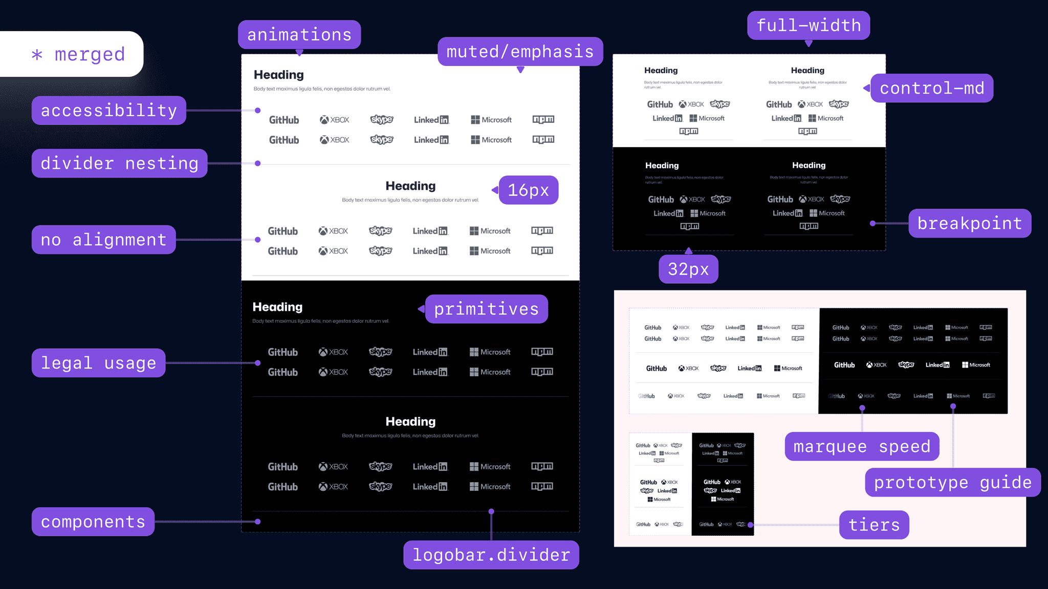
⚡️ Final High Fidelity⚡️
Prototype 👏
—Our final prototype was created over the span of 2 weeks after iterations from our low fidelities.
We created 30+ final screen but separated our screens based on user flows.
We chose our user flows based off of the most common interactions that were led by our interviewees. Additional pages were created to achieve our usage & company goal.
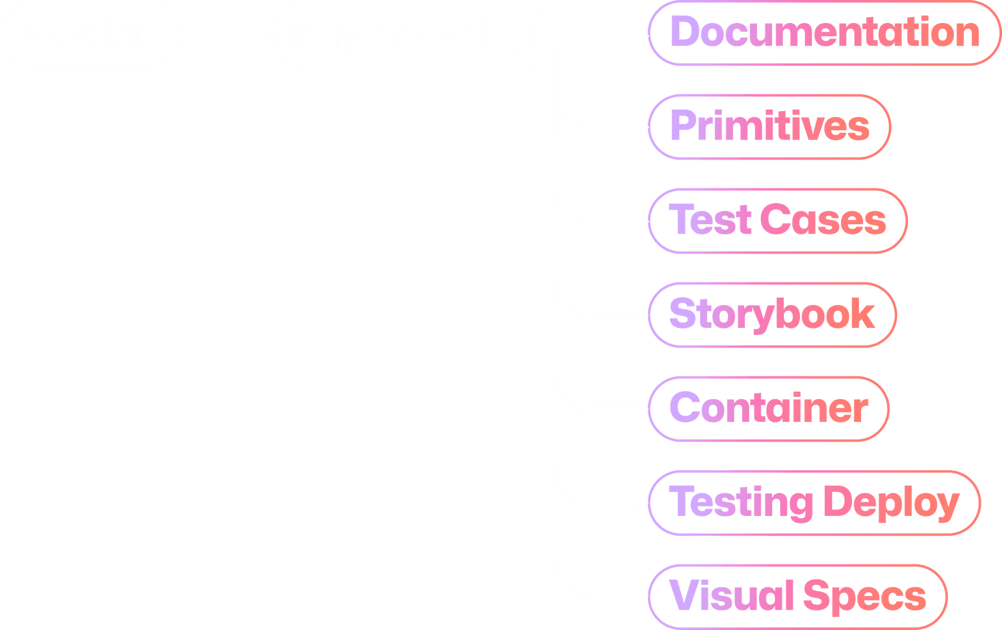
(1) Figma Designs
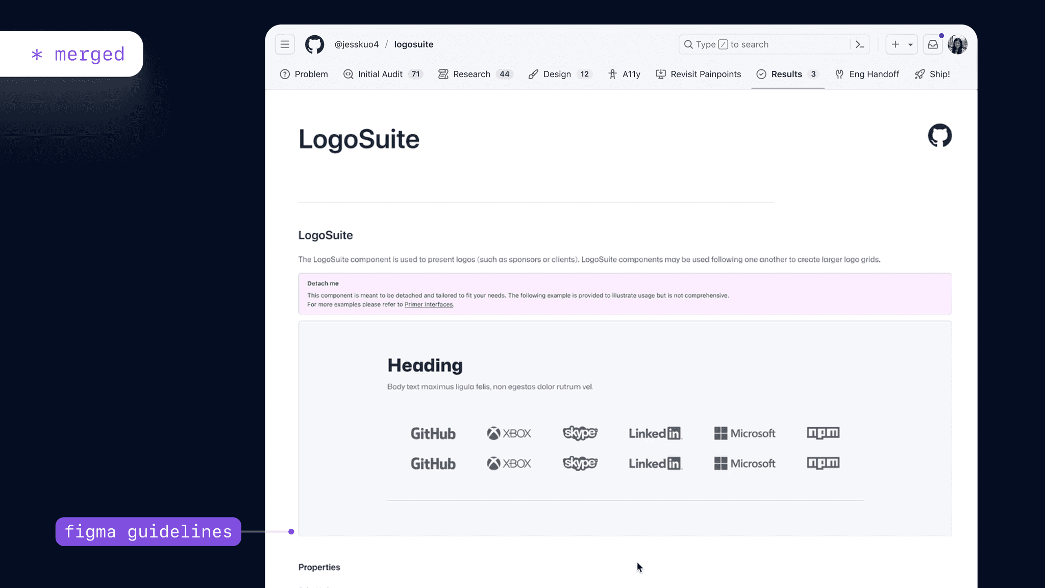
(2) Documentation
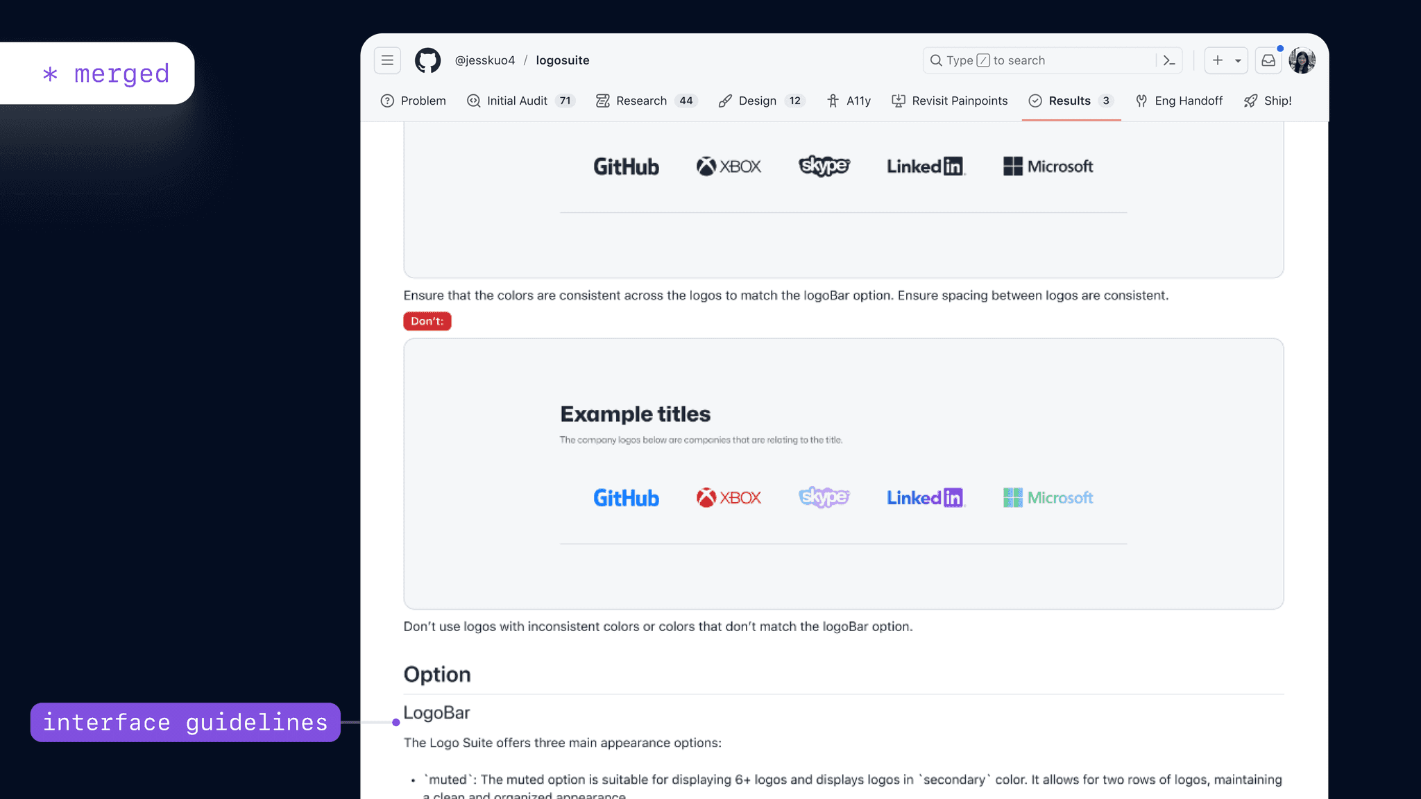
(3) Interface Guidelines
(4) Engineering
Design System 🧩
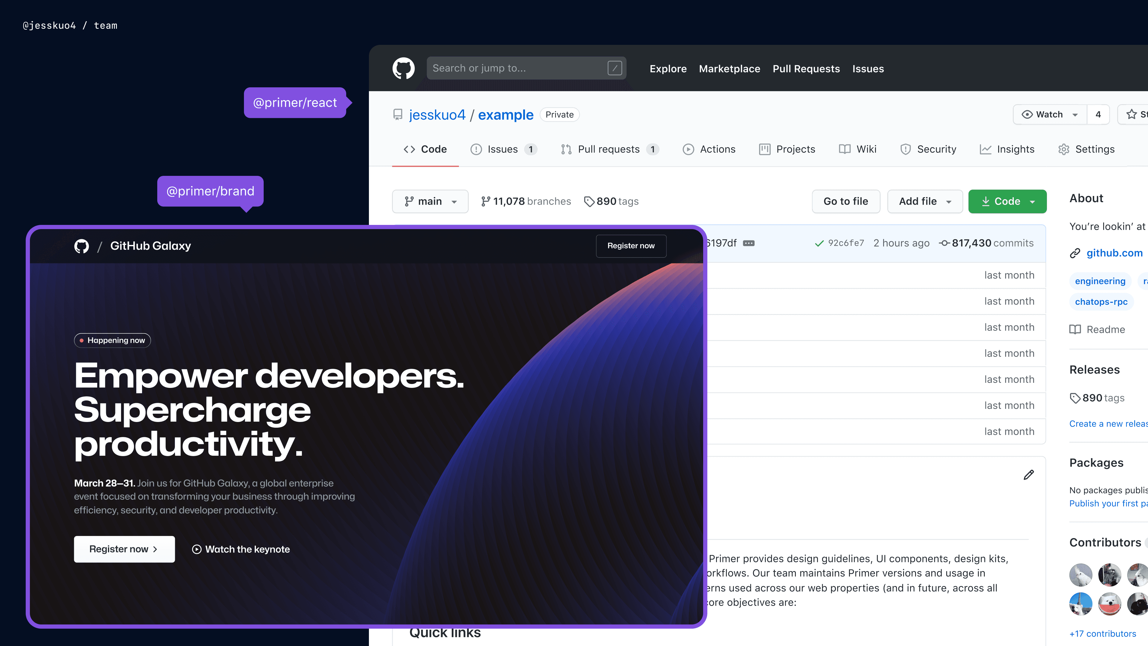
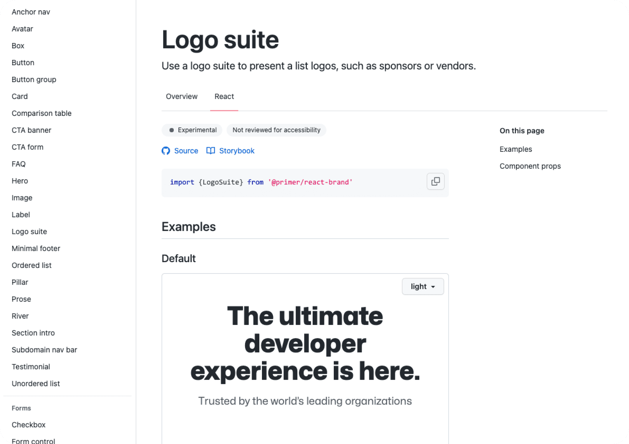
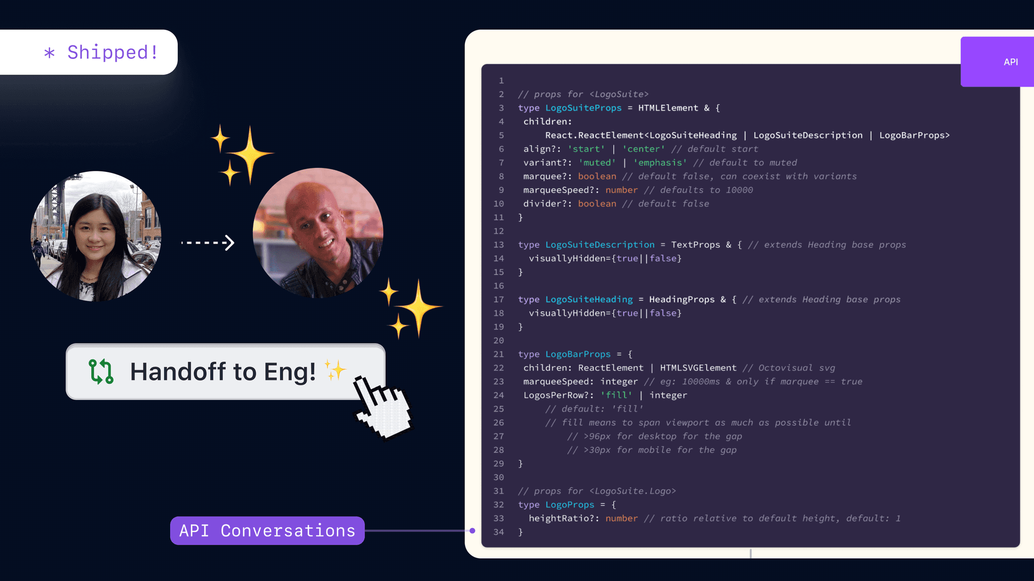
By successfully shipping the Logosuite to Primer Open Source, the component became a valuable addition to GitHub’s design system, reflecting a commitment to continuous improvement and community collaboration.
GitHub Source 🕹️
To access the Logosuite component on GitHub, users can visit the dedicated repository on GitHub’s open-source platform. This link provides access to the source code, documentation, and usage examples.
Figma Design 🍥
For a detailed view of the Logosuite’s design, the Figma file is shared publicly. This link leads to the Figma project where users can view the design specifications, different variants, and implementation guidelines.
Key Learnings ✨
—Design Documentation
As a global remote company, GitHub functions on an asynchronous communication style— using the GitHub platform to document processes, decisions, and collaborations.
Through my first month at GitHub, I’ve taken time to reassess my documentation process, find workflows that work for me, and learned to pause and plan how I want to communicate questions, concerns, or updates.
—Designer Developer Flow
One of the remarkable aspects of GitHub being an open-source platform and developer collaboration platform is its accessibility and ease of contribution.
GitHub’s unique culture has encouraged me to contribute, collaborate, and connect directly through codebases.
—Systems Thinking
By setting up props, APIs, and structures that are future-proof and system-first, we ensure the scalability of components. Accessibility is also a paramount consideration in design thinking, as GitHub places a strong emphasis on inclusivity, and designs are heavily guided by accessibility principles.
Systems thinking has shaped my birds-eye approach and future-outlook. Developing components, it is not enough to focus solely on immediate use cases


Streamline Meetups & Scheduling (App)
FULL PRODUCT LIFECYCLE
UX DESIGN
Fostering Social Connections during COVID.
LET'S

CHAT

Share Stories

Build Together