


A Meet & Scheduling Solution (Mobile)
FULL PRODUCT LIFECYCLE
UX DESIGN
CoLabFinds
All-in-one platform to streamline meetups, remote work, and gathering teams.
CoLabFinds is an app created for a client based in Seattle. To combat work isolation during covid, this app fills the market as a way for users to review work spots, schedule offline meets, and build community.
My Role
Product Designer
Domains
System Design
Visual Design
UX Research
Disciplines
Prototyping
User Testing
Iterations
Date
Fall 2021
10 Weeks

Client
Broadway Coffee ↗
Introduction
A coffee shop located in Seattle that wants to attract more WFH customers.
Industry
Coffee, Community
Timeline
10 Weeks
Problem ✋
—The problem is that workers and students are struggling to find suitable locations to work and study.
While coffee shops have traditionally been popular locations for remote work, the current situation has made it difficult to find comfortable and safe spaces with the necessary amenities for online meetings.
Challenge ⚡️
How can we help remote workers & students collaborate, book, and find suitable community work spaces?
Goal 📌
Create an app, solution, or product that will:-
Allow workers and students to conveniently find suitable locations to study and attend online meetings, with a focus on community and company-based options.
Connect with others who attend the same school or work at the same company, making it easier to find community.
Provide users with information on the location and ratings of coffee shops and cafes, as well as details such as the busiest times, favorite menu items, internet, outlets, etc.


👍
Solution Overview ✅
Through creation of personas, competitive analysis, interviews, surveys, alpha testing, and beta testing, we were able to identify key features that would be essential for our target users.
The result of our efforts is an app. The positive feedback from alpha and beta testing suggests that the app has the best potential and efficiency to become a valuable tool for remote workers and students.
keep scrolling for the research process

Research Process ⏳
Our team conducted multiple forms of research to determine the best Value Proposition, SWOT, TAM, and pain points of our audience.
Research Methods
Competitive Analysis
Storyboarding
User Journey
Customer Interviews
Surveying
Personas
Sample Size
3 Analysis
120 Survey
4 Interviews
10+ communities
2 Personas
User Groups
Students
Companies for B2B
Remote Workers
Foodie/Cafe Hoppers
Platforms Used
Zoom
Google Forms
Facebook/Reddit
Mobbin
Canva

Competative Analysis 📊
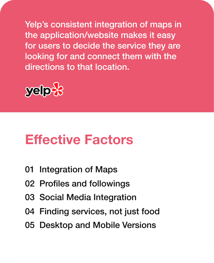
—Our competitive evaluation focused on Yelp and product market holes.
seeing it as the most commonly utilized app for locating nearby restaurants, food, or services. Other analogous offerings in the niche, boasting different features, encompass WeWork, Zoom, DeskHub, When2Meet.
Accessibility Review 🎗️
—What are some accessibility points to consider when building our app?
Are the current products accessible? What standards should we evaluate off of?


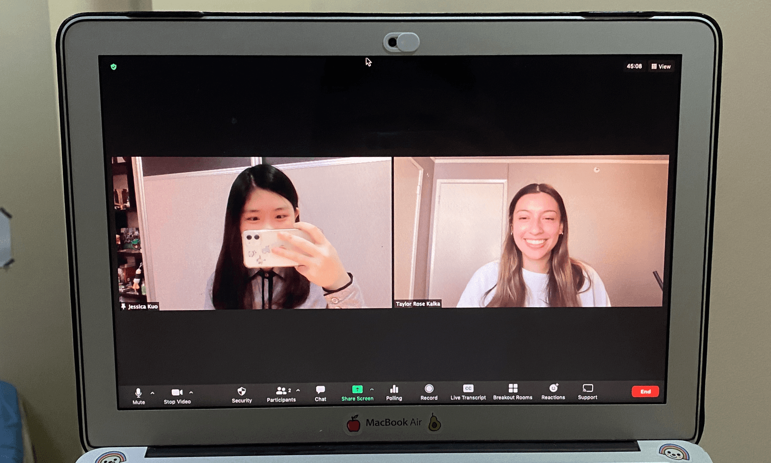
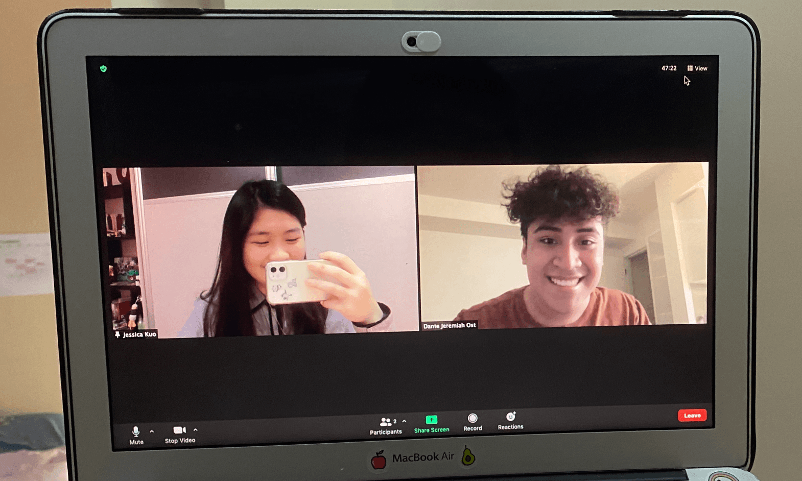
User Interviews 🤝
User interviews were conducted on different types of our user groups to understand the pain points & complexities to this issue. We want to pinpoint the user journey and potential personas of our products. In addition, we want to develop empathy and understanding out of users.
Full-time Worker (FTW)
• He is an academic worker that requires devices such as computers and laboratories on campus.
• Only when he needs to deal with some urgent work but his child is too noisy, then he would choose to go to the school library.
Interviewee 1
A 32-year-old post-doctor with one kid.
International Student (IS)
• During the pandemic, he studies outside two or three times a week.
• The purpose of studying outside for this interviewee is to improve his study efficiency.
• They miss their friends and real life company when working.

Interviewee 2
A 21-year-old Junior student who majors in CS.
Part-time Worker (PTW)
• During the pandemic, she worked in China for one year in person while taking courses online.
• She just started working online recently. She likes to explore the city by studying and working at different cafes.
Interviewee 3
A 28-year-old Senior student majoring in Econ.
American Student (AS)
• During the pandemic, she worked in China for one year in person while taking courses online.
• She just started working online recently. She likes to explore the city by studying and working at different cafes.
Interviewee 4
A 19-year-old Sophomore who is majoring in ACMS.
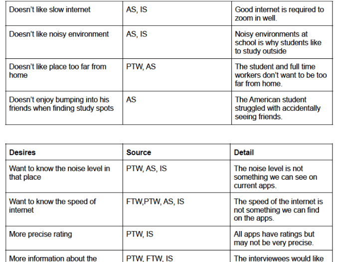
Pain Points 🤧
—Through the 4 interviewees and 100+ survey responses, we concluded that there are 3 primary pain points:
Want to locate a suitable location. This is often done through endlessly scrolling reviews and pictures.
Arrive at the location to discover the wifi connection, seats available, or outlets. Not enough information is shared.
Wish to collaborate with their peers and miss interpersonal connections when working. It’s hard to find locations that parties all like.
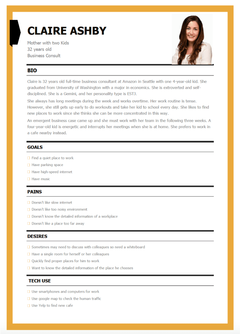
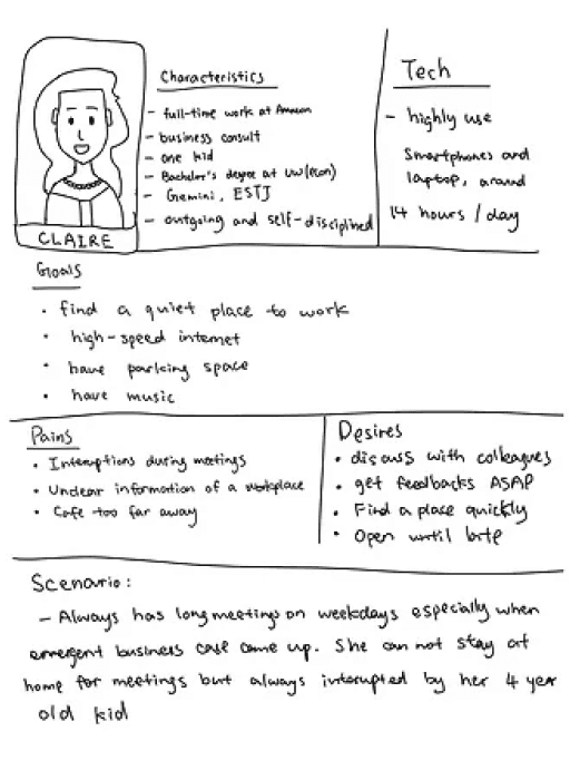
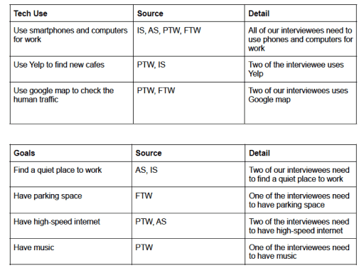
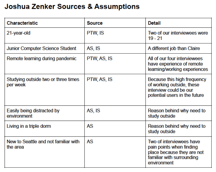
Personas 👥
User Personas were developed through using the information collected from the interviews. Low Fidelity Personas were created through graphs to show Characteristics, Desires, Tech Uses, Goals, and Pain Points. They were then sources to interviews.
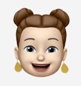
Claire Ashby 🙋♂️
Overview ⭐️
Work from home female with kids and requiring online meetings during work.
Features 📲
Filtering out locations for utilities and quick access. Needing to meet with clients often and early.


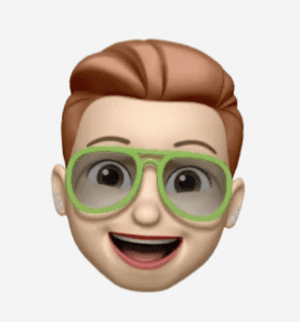
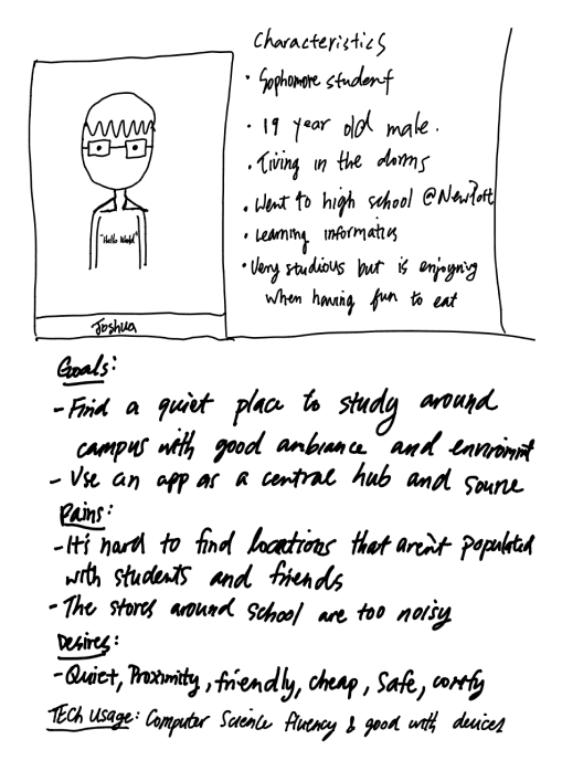
Joshua Zenker 🙋♂️
Overview ⭐️
College student male that attends remote classes and needs to complete group work. Currently does not own a car.
Features 📲
Creating groups with individuals and being able to share real time studying locations to encourage co-working.


User Journey ✈️
—User journeys were developed after the storyboards. We utilized the pain points to create a journey based on one of our personas, Claire.
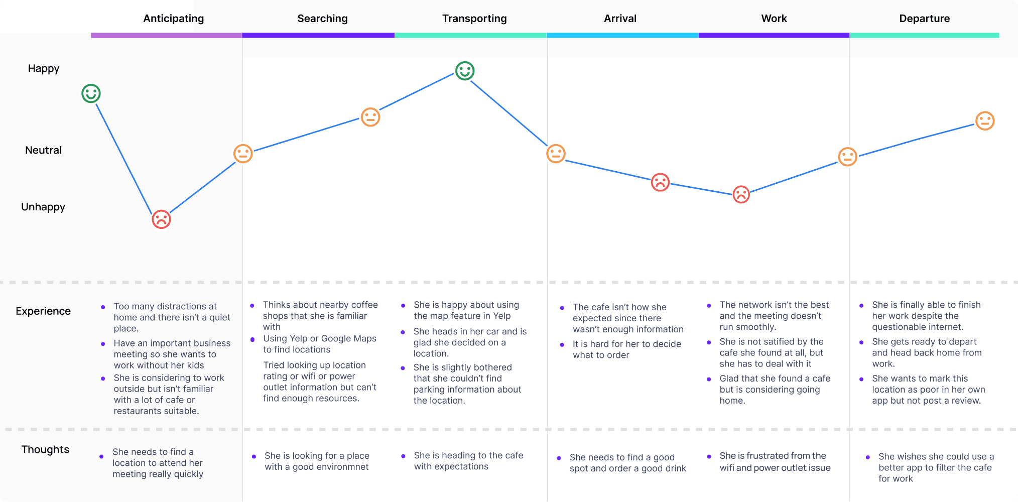
keep scrolling for the low-fidelity process

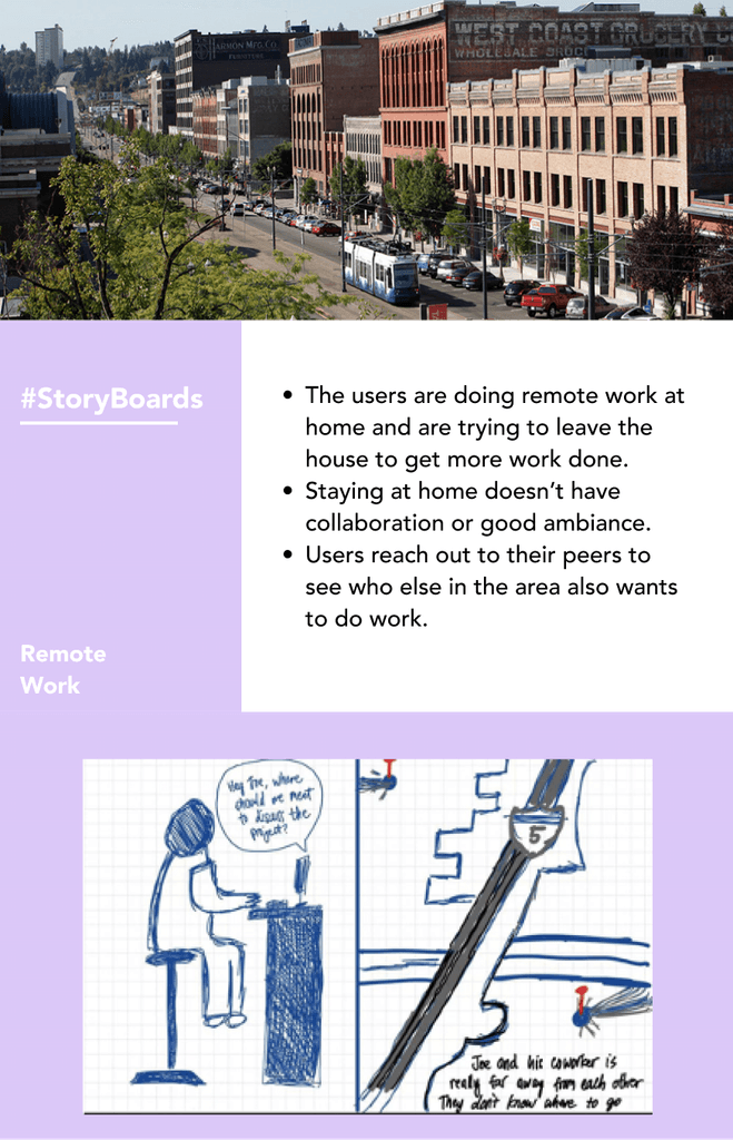
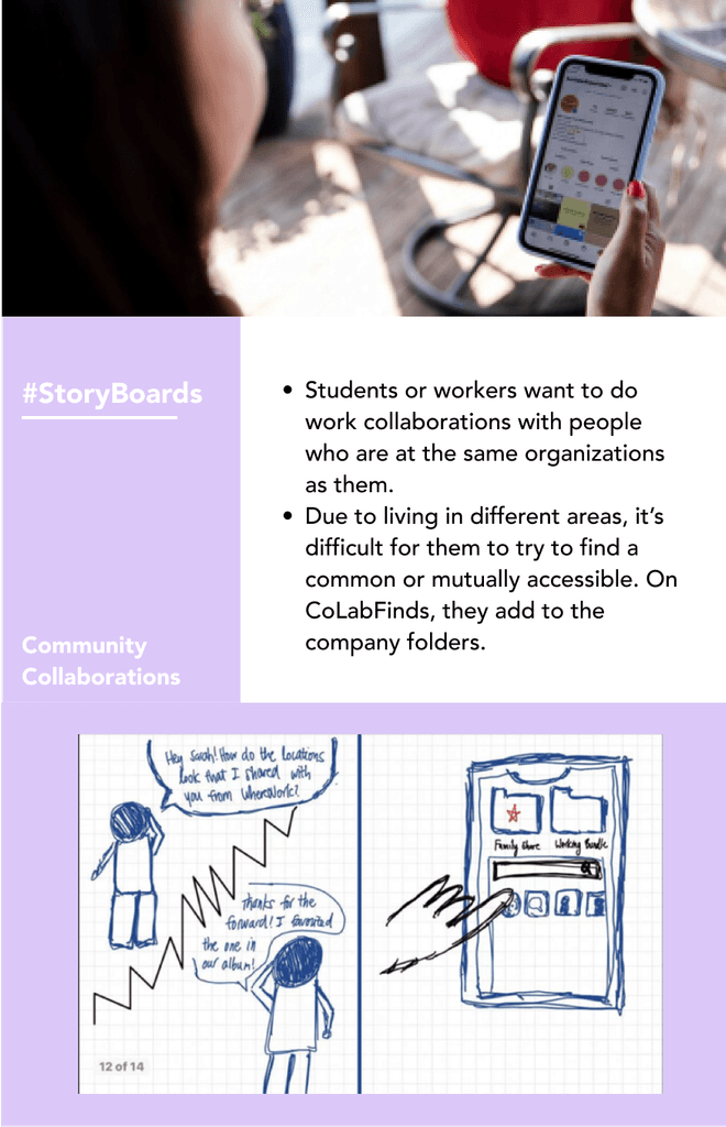
Storyboarding 🔖
Competitive Analysis was primarily based on Yelp, as we found it to be the most popularly used app to find restaurant, food, or service locations nearby. Other products similar in the field but with different functions would include WeWork, Zoom, DeskHub, When2Meet.

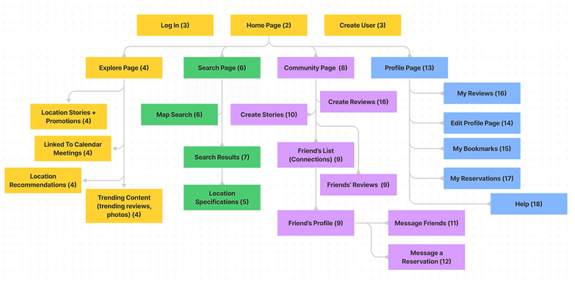
Information Architecture 📊
—Priority features were created to have high affordances and feedback from the landing screen.
The goal is to help users find information and complete tasks. To do this, we figured out to understand how the pieces fit together to create the larger picture, how items relate to each other within the system.
The complete functionality of our application is represented, and the visual organization of these features helped us to design the various navigation paths for the user through the application.
Sketching ✏️


Challenge ⚡️
How do we implement graphs, filters, collaboration aspects, social media sharing, and also integrate B2B selling points in our app?
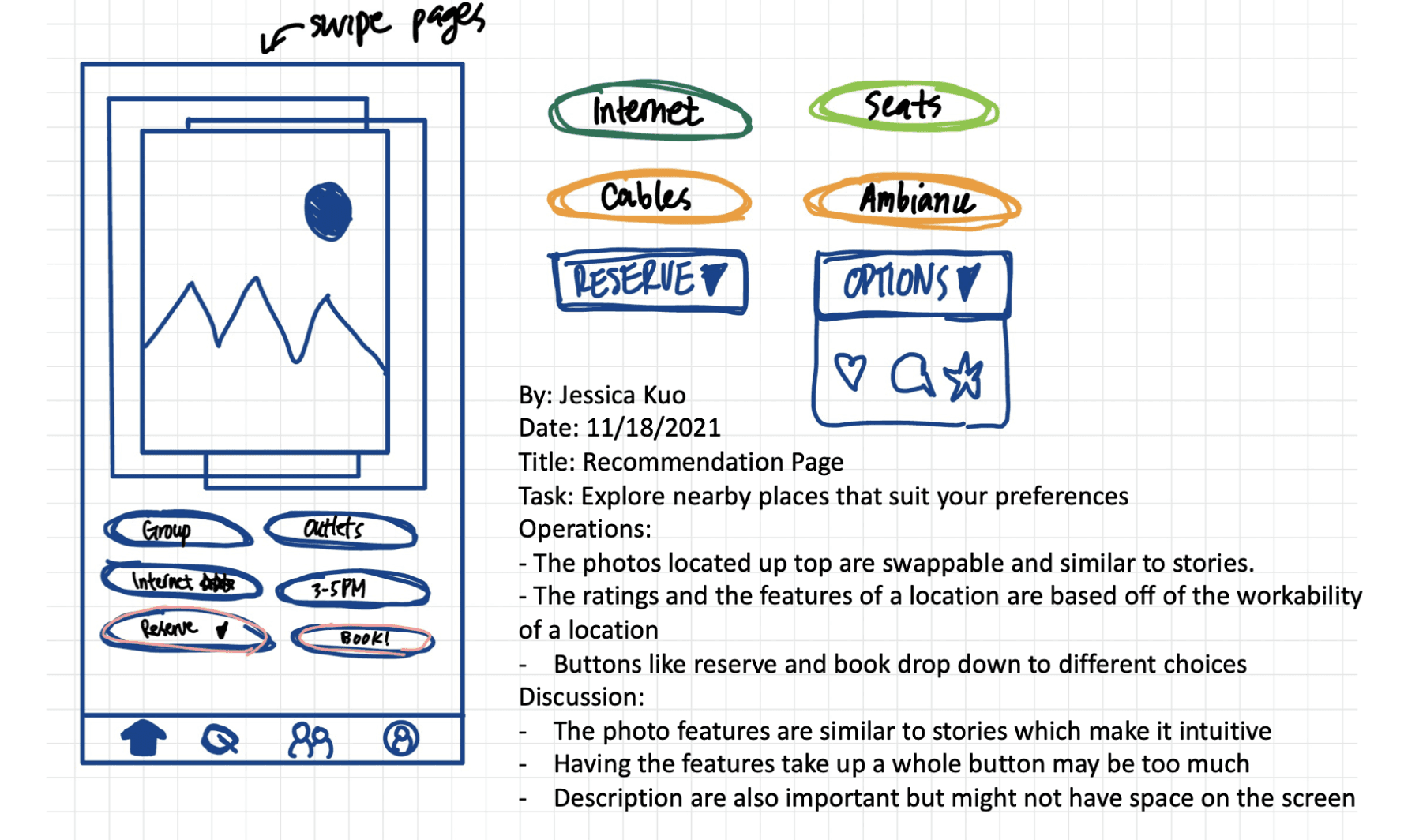
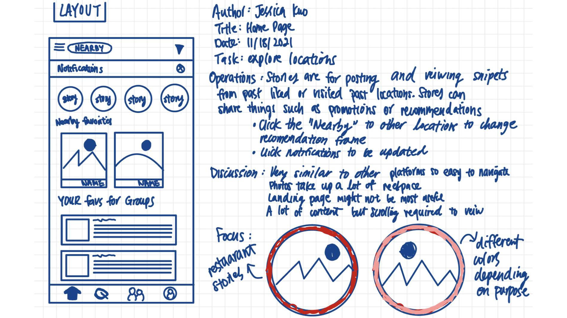
Prototyping 💭

User Flows 🔂
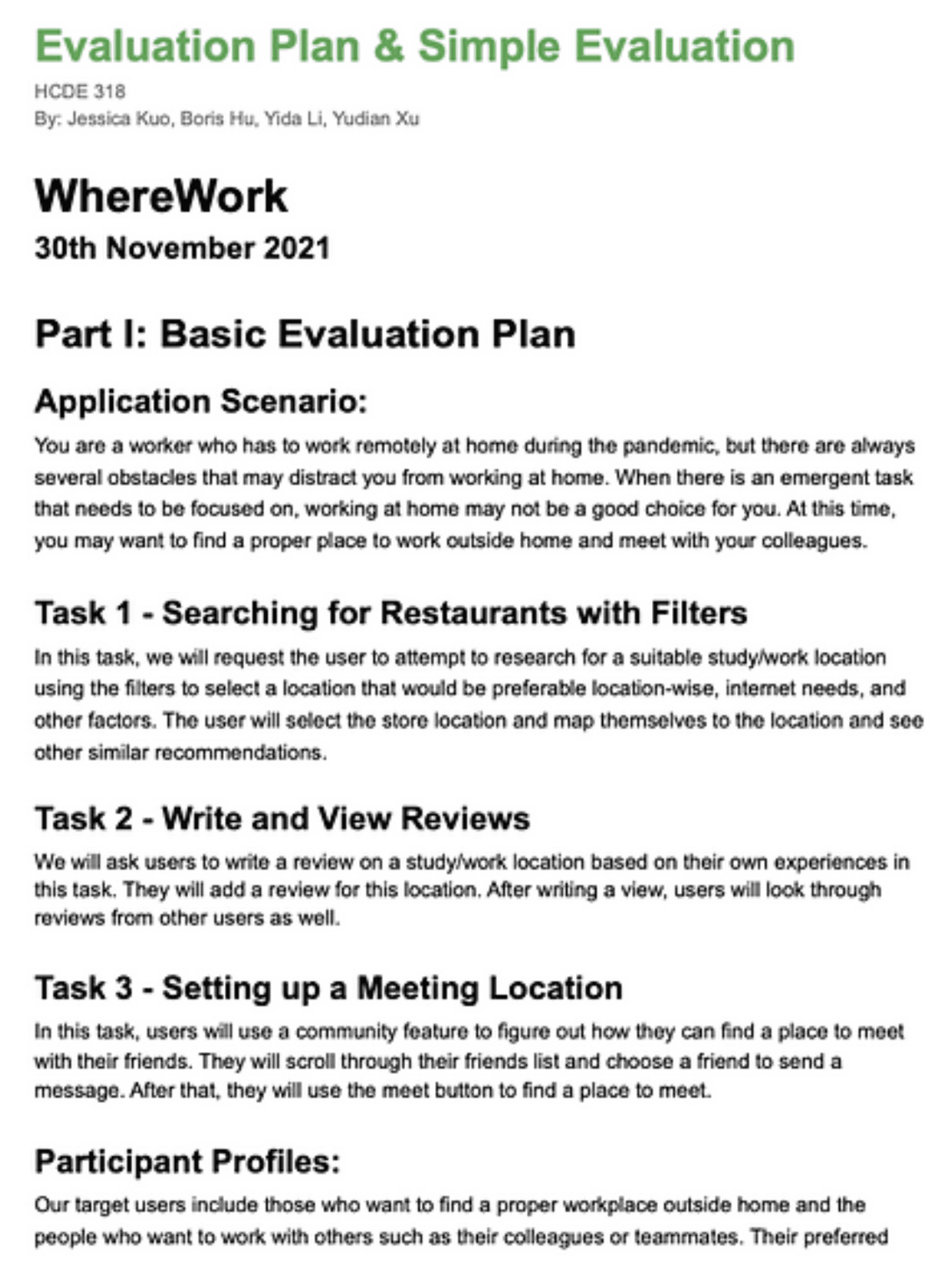
Our prototype focused on three completion user flows:
Searching for filtered locations and utilities.
Writing and viewing accurate reviews.
Streamlining the meet up and scheduling process.
keep scrolling for the high-fidelity process
User Testing 🤝
—Volunteers were compensated with gift cards and we gathered 3 main insights.
To test our low-fidelity prototypes before deploying to production, we initiated 2 rounds of user testing of our prototypes. After 2 sprint cycles of implementation, we gathered our best designs to create our high fidelity.
Evaluation Plan 🔖
—Monitor actions of users to freely browse our app for 20 minutes.
A simple and more complex evaluation plan was devised for our customers to walk through different scenarios. Their behaviors, pain points, questions, and issues were documented.
Challenge ⚡️
How do we implement graphs, filters, collaboration aspects, social media sharing, and also integrate B2B selling points in our app?
Quote 🔊
“This app is powerful, but hard to tell the application is focusing on work and workplace sharing...”
Insight 🤔
We provide great features but can be overwhelming for the users. We need a selling point.
Solution 🧠
Our team will focus workplace sharing than focusing on the social media/location reviewing aspect.
Quote 🔊
“I am very impressing about this meet feature. However, I spend a lot of time to find this feature...”
Insight 🤔
Certain features are harder to find. We need higher affordances to show these features.
Solution 🧠
Our team will restructure the information hierarchy and CTAs of our app to reprioritize.
Quote 🔊
“The B2B aspect is great but more explanation needs to be made about how to connect with companies...”
Insight 🤔
“The B2B aspect is great but more explanation needs to be made about how to connect with companies...”
Solution 🧠
Alongside the high fidelity, we may need documentation to share how companies can implement this app.
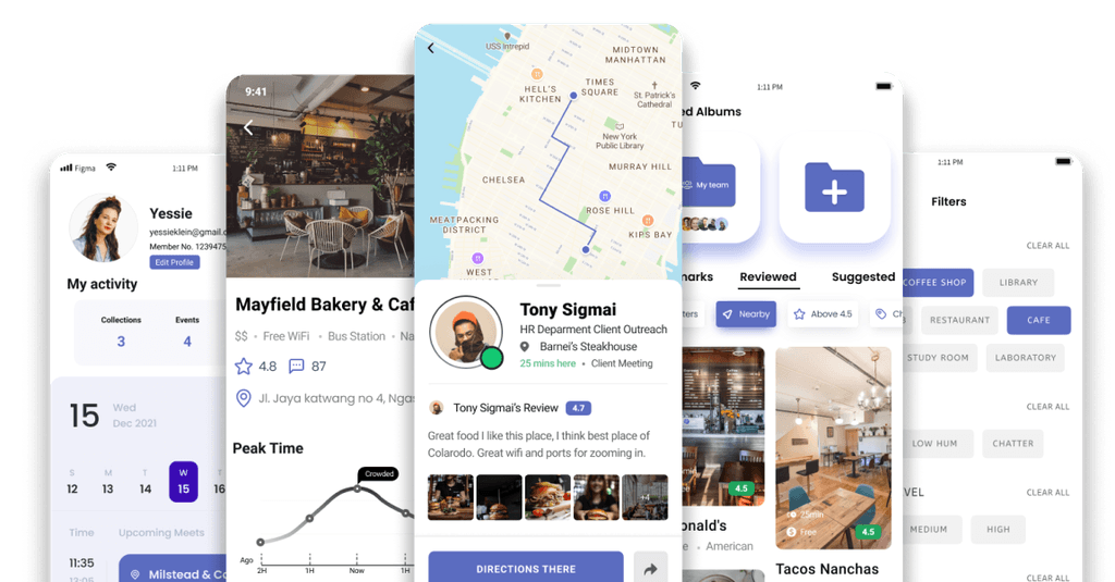
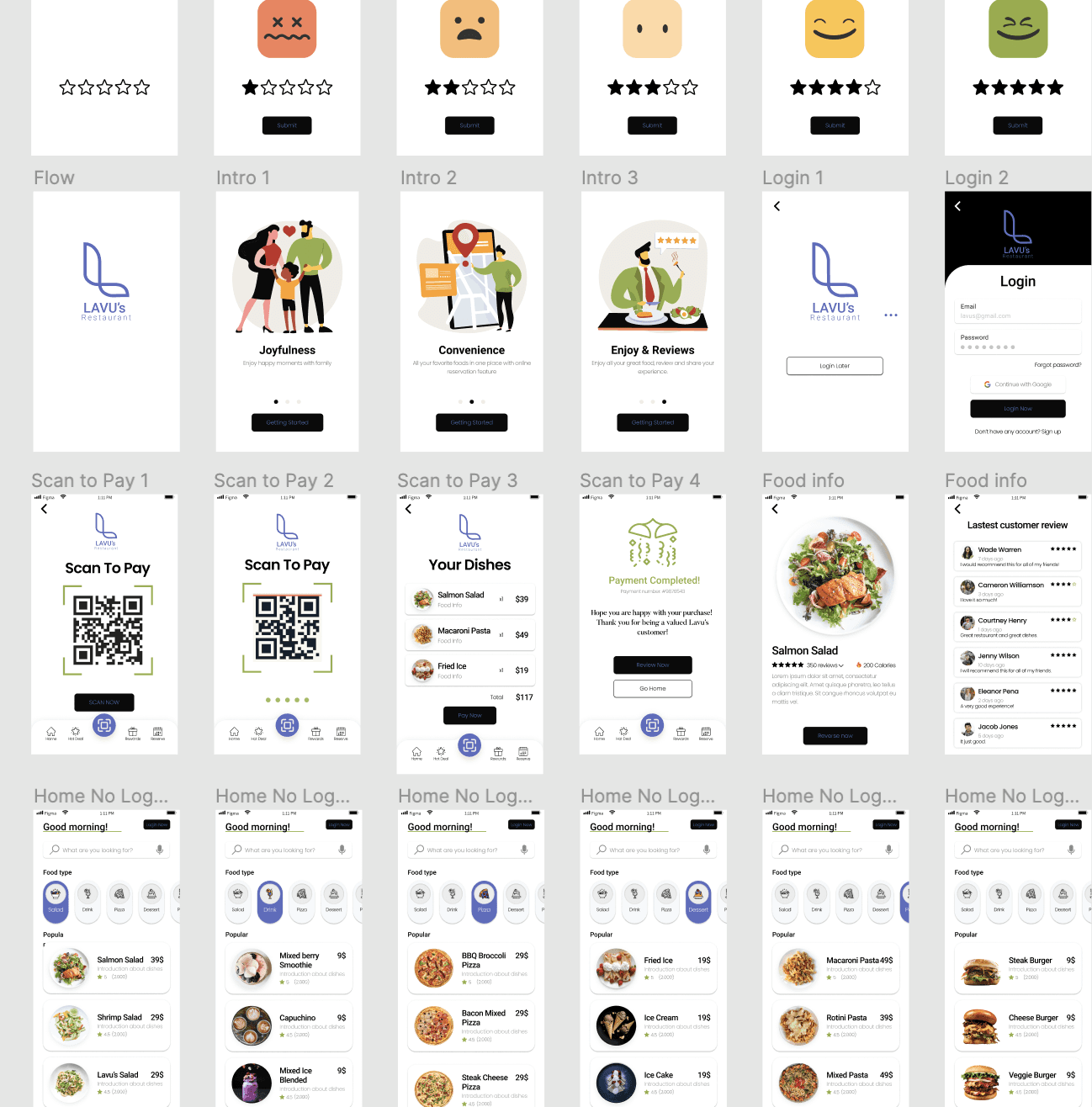
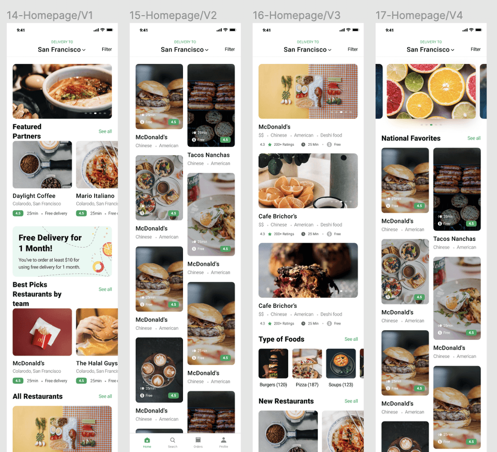
⚡️ Final High Fidelity⚡️
Prototype 👏
—Our final prototype was created over the span of 2 weeks after iterations from our low fidelities.
We created 30+ final screen but separated our screens based on user flows.
We chose our user flows based off of the most common interactions that were led by our interviewees. Additional pages were created to achieve our usage & company goal.

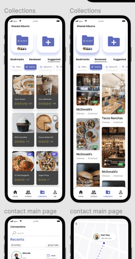
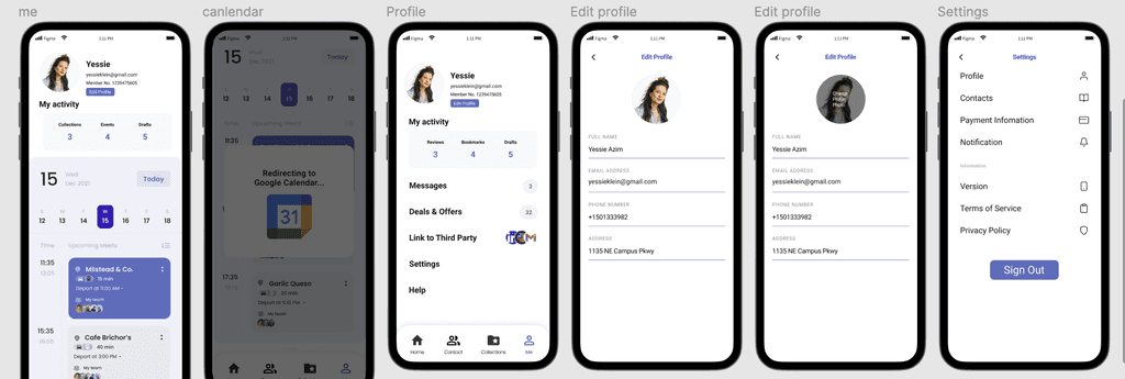
(1) Apply Filters
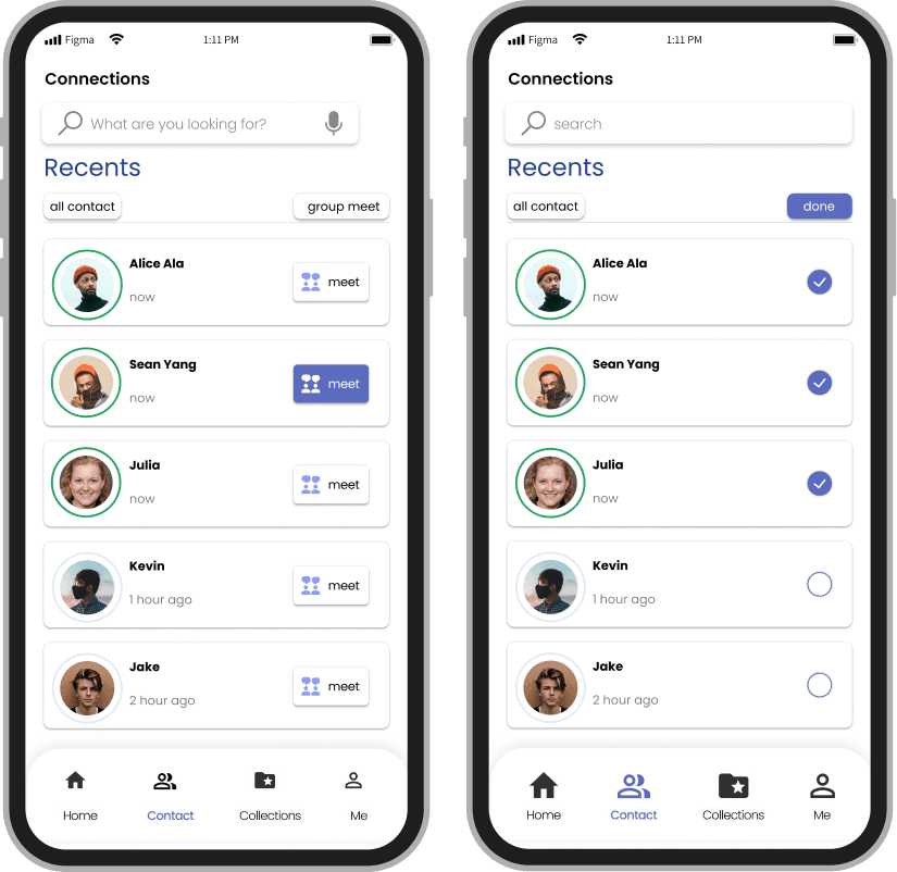
(2) Contact

(3) Meet Feature

(4) Collections

(5) Recommendations
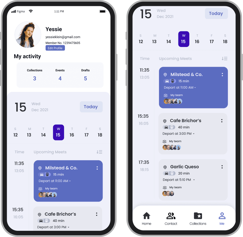
(6) Profile
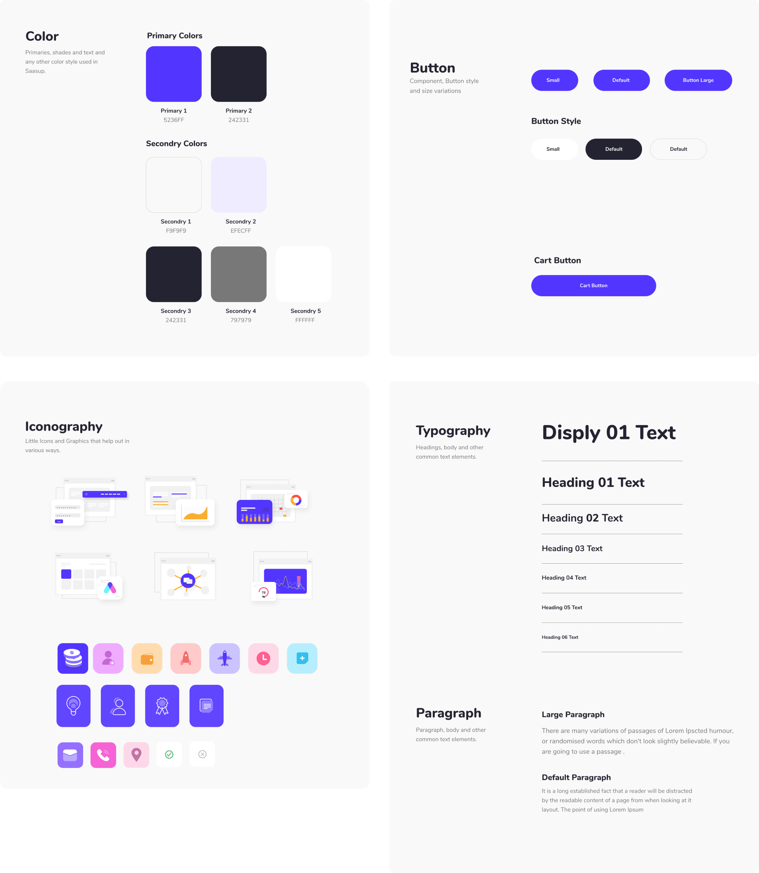
Design System 🧩
We created a design system that would not only build the consistency but also save time for the client as they build new features. This will improve the overall process and experience for the website.
Interactions 🕹️
Interactions, including carousals, viewports, and animations have been added to the prototypes for presenting during the pitch deck. View these creations on the figma prototype!
Figma 🍥
Visit the final figma design file with interactions, pitch deck slides, low fidelity, high fidelity, and everything in-between through the link!
Potential Next Steps ☄️
B2B Research
• Ask Businesses or Companies to test our product for the B2B aspect.
• Learn about blockers for implementing within employees.
Edit Prototypes for LoFi
Design System
• Our designs currently use design systems in our Figma but there isn’t a master file for future usage or implementation.
• We need a design system.
More Cohesive Designs
Deploy Code
• Partner with an engineering team to bring this product on to the iOS and android app store.
• This would require more interactions consideration.
Engineer Out Designs

Key Learnings ✨
—Isolating Unique Value Proposition for App (UVP)
Having numerous features for a product is great. However, a unique value proposition or feature is what will sell the product. There needs to be a good balance between our key features and additional, pleasant perks.
—Narrowing Down Target Audience
An app with a B2B and B2C aspect would be able to capture a large target addressable market (TAM), however, it would also create discrepancies during interview and user research stages. It may be better to focus on one.
—Diverse Research Methods and Implications
This project really allowed me to experience and play with numerous research methods. I learned how to scale these research methods, prioritize, outsource, and analyze these findings for the best results.


Shipping Systems-First, Responsive Components
visual design
DESIGN SYSTEM
ENGINEERED
Reusable Assets for GitHub Landing Pages.
LET'S

CHAT

Share Stories

Build Together